5 psychology principles behind UI design (Part II)

In the last blog post, we talked about color theory. Knowing about color harmony and color psychology will help us create better designs and interfaces. We will be able to induce emotions and feelings, draw our user's attention and improve usability.
But, there are 4 other psychology principles that can take our designs to the next level:
1. Gestalt principles
In 1920s, German psychologists Max Wertheimer, Kurt Koffka, and Wolfgang Kohler wanted to understand how humans perceive and understand things that they see and hear. They created the Gestalt principles.
Gestalt Principles are principles/laws of human perception that describe how humans group similar elements, recognize patterns and simplify complex images when we perceive objects. Designers use the principles to organize content on websites and other interfaces so it is aesthetically pleasing and easy to understand.
Interaction Design Foundation - IxDF
These are the ones you want to keep in mind for UI design purposes:
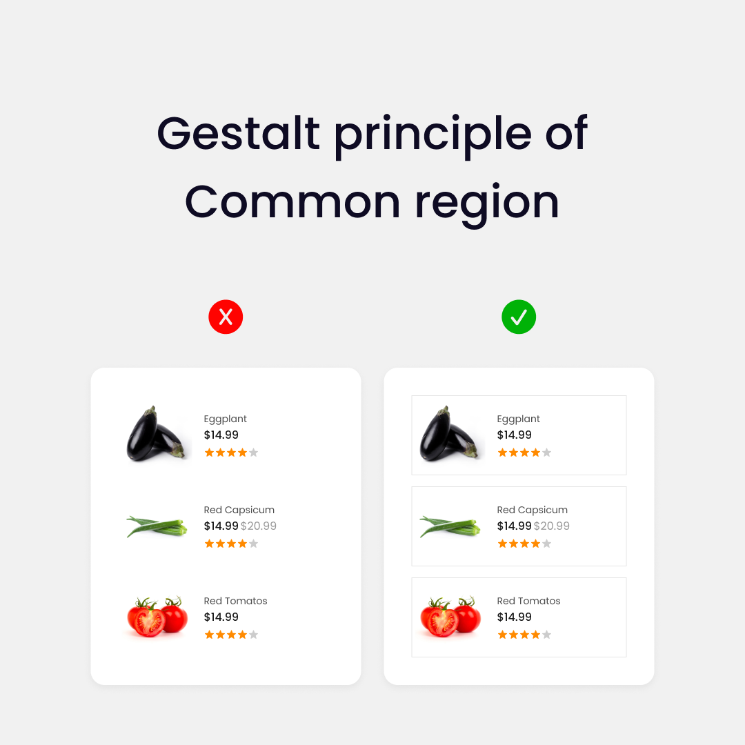
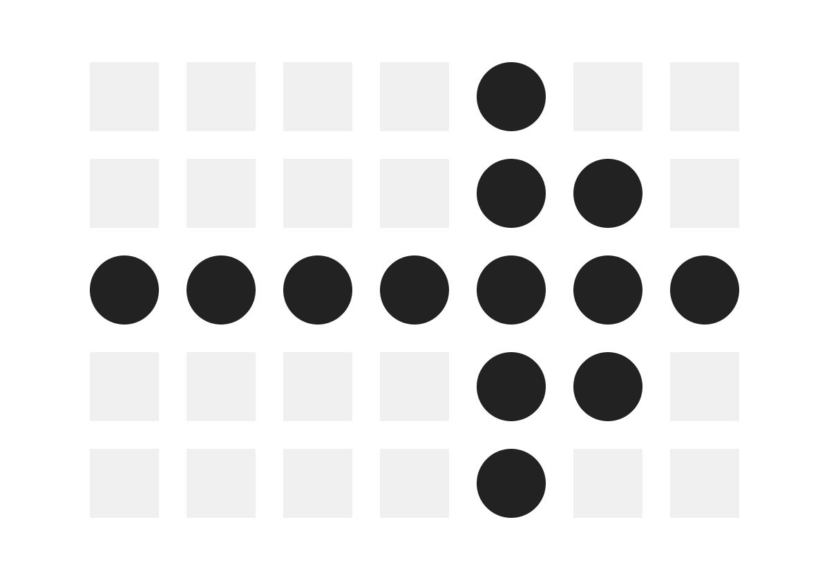
Common region:
Objects presented within a boundary or a common region are perceived as parts of the same group.
We can use this principle to help users relate UI objects easily:
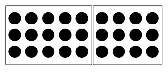
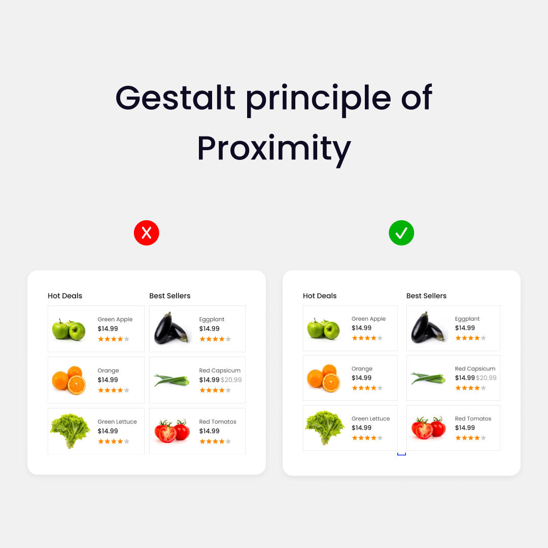
Proximity:
The Gestalt principle of proximity states that we perceive objects that are close to each other as more related than objects that are further away.
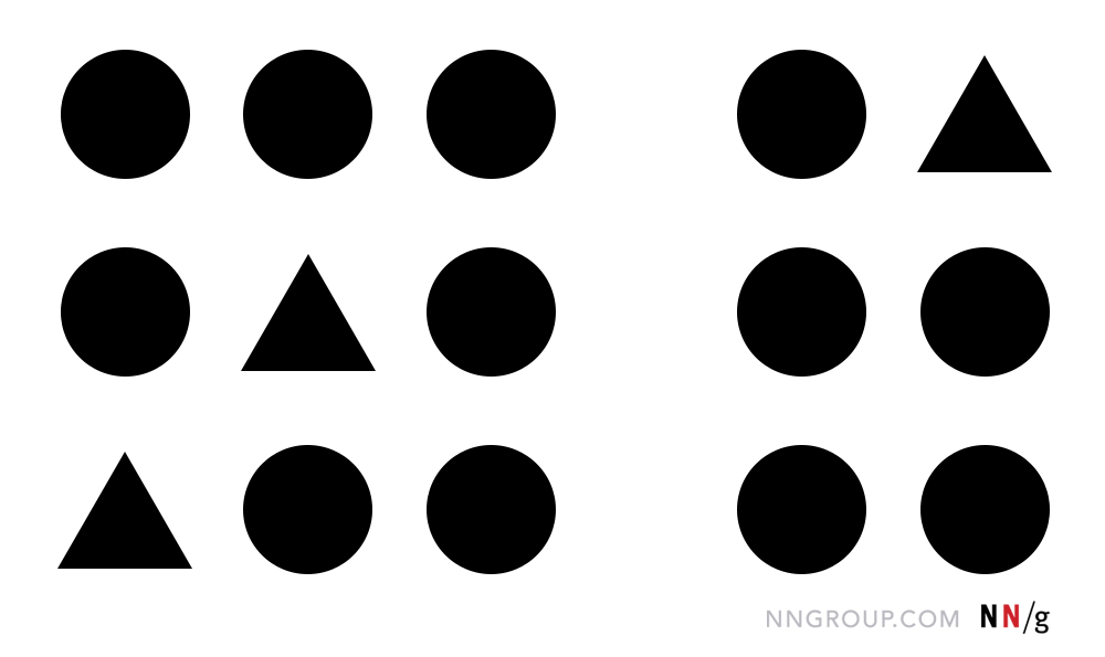
This can help us create interfaces that are better organized and easier to understand:
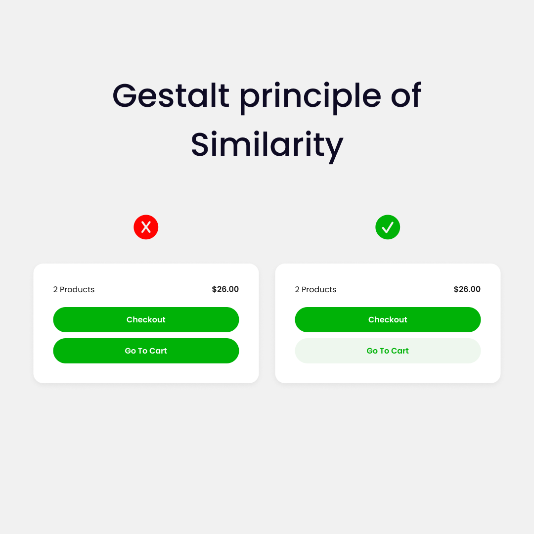
Similarity:
Design elements that appear similar in some way — sharing the same color, shape, or size — are perceived as related, while elements that appear dissimilar are perceived as belonging to separate groups.
We can use this principle to organize elements in a more clear way or emphazise call to actions:
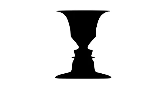
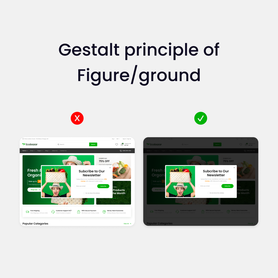
Figure/ground:
When looking at an interface, the human eye automatically separates objects from the background.
This is a familiar example:
We can use this when designing an interface by creating contrast and prioritizing an element. For example, a pop-up:
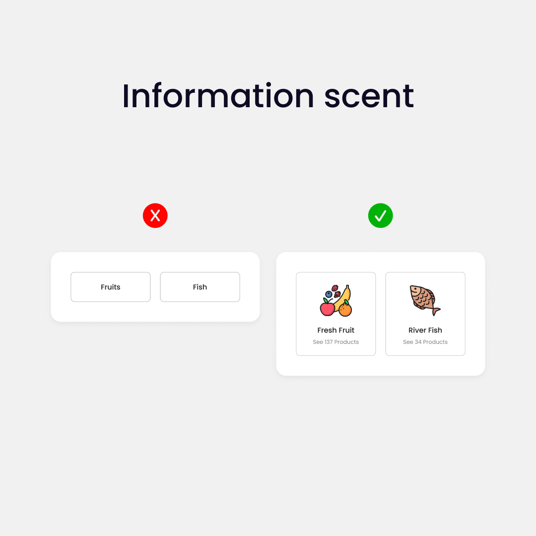
2. Information scent
In UI design, information scent describes how well a name or symbol represents the page that it leads to.
We want to provide the user with relevant messages and visual cues or hints about what information a site contains.
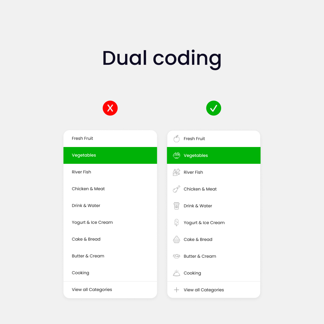
3. Dual coding
The human mind processes information using two different channels:
- Verbal
- Visual
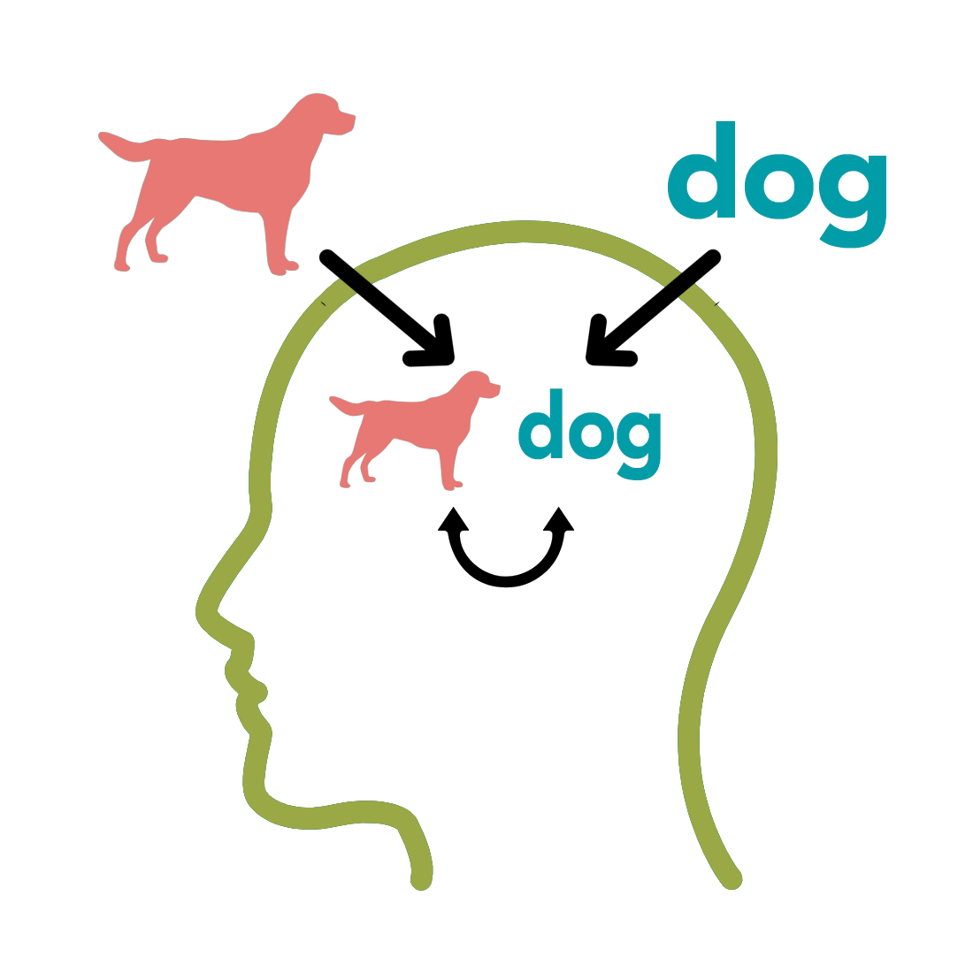
Providing users with both representations, verbal and visual, we can help them understand the information better.
Use both: images/icons and text, to represent different key functions.
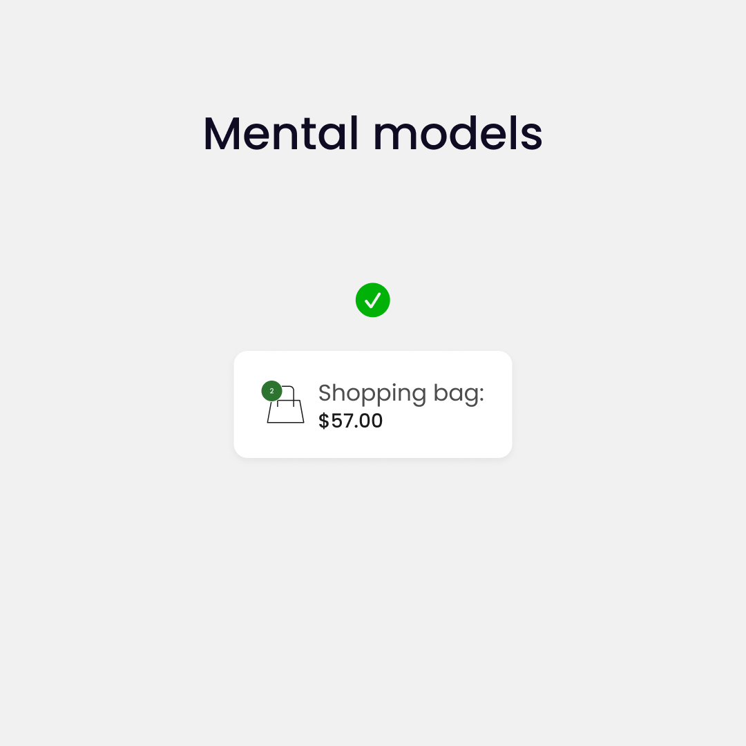
4. Mental models
Mental models are internal representations of the external world.
What users believe they know about a UI strongly impacts how they use it. Mismatched mental models are common, especially with designs that try something new.
Users already have an idea of how an interface should work, so we want to play by the standards to create a good experience.
Internalizing these principles will make a huge difference in your designs.